Ward Roberts: Minimalism
Photographer Ward Roberts is an old soul. Born in Australia, now living in New York City amongst the hustle and bustle of young souls seeking their seven seconds of fame.
This is something 28 year old Roberts seems to transcend, approaching everything he does with a deeper comprehension of life.
While many focus on creating a brand, a robust portfolio, and commercial value all at the speed of light, Ward works his ass off to make art: finding truth and knowledge; revealing beauty; rescuing the likeness of places, scenes and people from the transience of life.
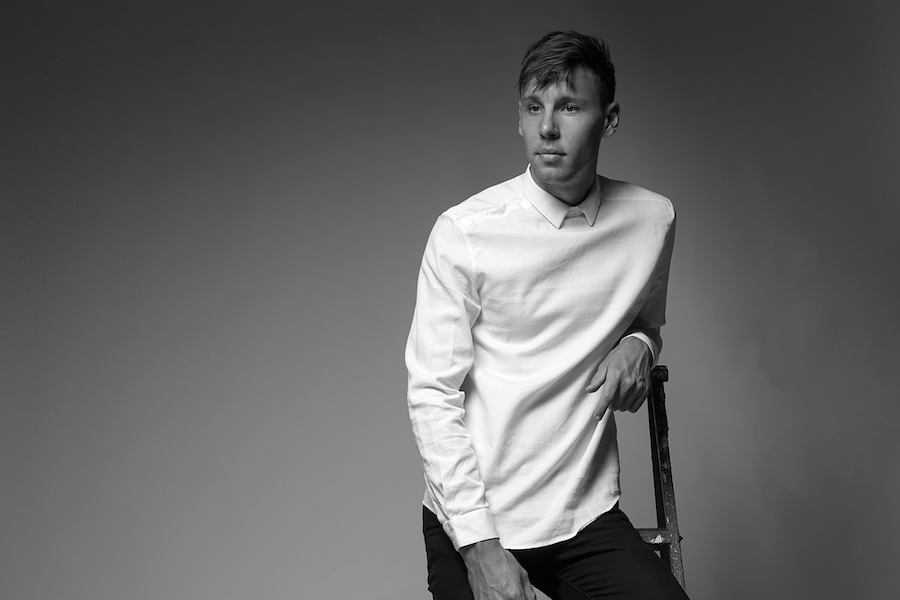
Ward Roberts, photographed by Robert Clyde Grima for 1985.
His work captures the world right in front of us, but it is through his photographs a different perspective is born - an anthropological study - and a certain truth. All with an aesthetic quality, making it a pleasure to consume and connect with. If it's a landscape, he shows us humanity, through minimalism and the absence of human figures. If it's a portrait, he shows us a human, through minimalism and the absence of environment.
It’s a delicate percussion of documentation and Minimalism, perhaps influenced by his unique background, spending his formative years as a child in Hong Kong before returning to his birthplace of Australia in his teens. “There's a lot of repitition in Asia, whether it’s the architecture or the lifestyle of certain people, the structure, everything was a very consistent repetition. I’ve just been around it, so I guess it subtly comes out in my work. I’m drawn toward it." says Ward.
Today he is a painter, painting with his camera through atmospheric elements, environment, and color. Sometimes on the fly, and sometimes with much patience. He finds his tools in the environment, often waiting for them to descend, literally, from heaven. Never Photoshopped, always in camera, with his Hasselblad.
After spending time with Ward the last few months, I’ve been contemplating how to define what it is that makes him different ––and it all boils down to the fact that he is an old soul - a quite lovely old soul. He naturally creates with principles that Instagram kids have lost: Take action with intention; Have a plan, have patience, and proceed thoughtfully; Make choices that compose a connection; Do things for a reason, and with purpose; See the bigger picture; Focus and be persistent.
Here, Ward talks us through his work, from his most recent portrait series "O" to what he’s working on currently: tentatively titled The Bushwick Series, perhaps his most challenging project to date. And a few things in between…
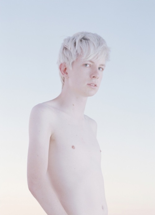
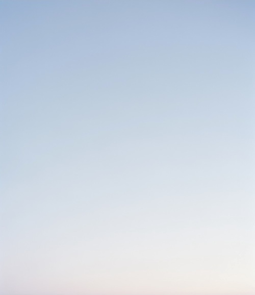
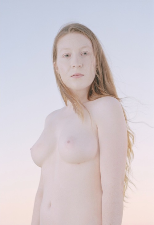
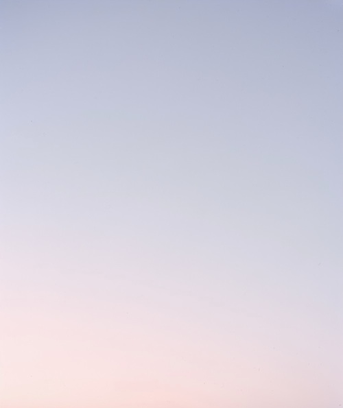
"O" by Ward Roberts
O
This is my newest series. “O” is the symbol for oxygen. It explores the idea of oxygen and the connect-ability. I had always wanted to do a series that is all about connecting everyone with everything: land, culture, diversity. There’s an overwhelming loneliness that people seem to have now with the environment and I wanted to bring back a connect-ability, that no matter who you are or what you do there’s this underlying connection.
“O” includes what I like to think of as sky portraits. Even though there’s not that human element in there, to me, they’re portraits. With the sky portraits, the idea was to be able to have that portrait connection without putting the human element in.
I find myself very drawn toward very pale skin, almost transparent if you will. To me, there’s something really beautiful and fascinating about that - just completely transparent, white skin. With this series I wanted to blend the human skin as much as possible with the sky using light. So I took away all the shadows by working on the lighting to get it really clean and flat. And then choosing the time of day where the sky was flat but colorful. Making that connection without going into Photoshop.
The angle was something I experimented with a lot. I experimented with having 50% sky and 50% portrait, so there was quite a lot of negative space above the portraits. The low angle basically was due to being able to get the torso to a certain level where it was just sky, and to do that I had to shoot large format and had to shoot from a low angle. Also inspired by some of the 18th century painters and their portrait techniques and their angles, and certainly some of the heights as well, so I subtly tried to incorporate that.
I shot this series at the beach in Australia. The goal was to get as much height as I could from an empty horizon line. Which turned out to be quite challenging.
Another factor was choosing the time of year where you can get this beautiful pastel sky, which is about two months of the year. Something I love when I shoot is that I don’t want full control (well of course I always want it) but by organically taking that away there’s nothing I can do to control the elements, which is the beauty of it. I’ll turn up one day and it will be freezing cold, or there might be clouds in the sky, or it’s really windy, and there’s something really beautiful to me about that lack of control in the process. It adds the human element. It’s the imperfection.
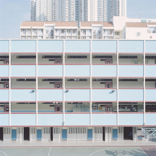
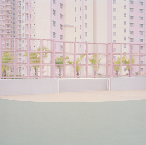
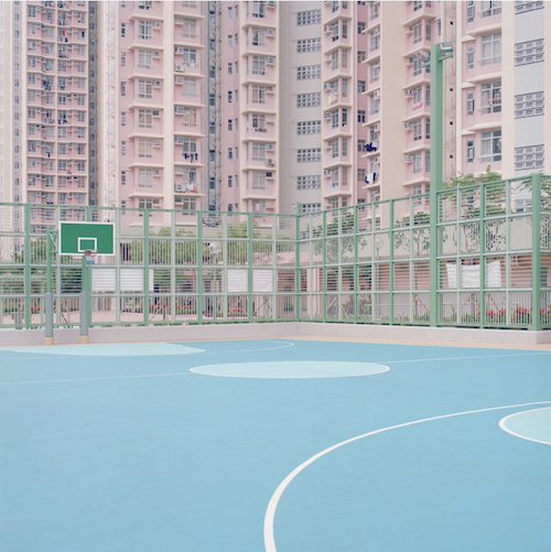
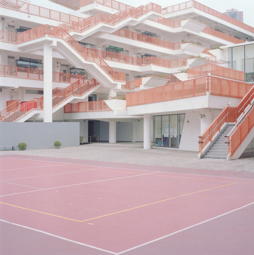
"Courts" by Ward Roberts
COURTS
With Courts, there’s this connected disconnection, so there’s sort of this contradiction, which is something I’m really drawn towards. It’s being able to relate but then there’s something telling you that you can’t quite identify with it properly as you have previously with other elements. In Courts, with some of them I put in a human element if you will. Like there’s a ball I specifically placed there. Or I’d leave something in there, and the angle would allow for a sort of humanistic element. Something happens there, but it’s not happening there.
In the early stages of Courts I tried including people, but to me, it didn’t really work. It didn’t really say what I was trying to say. It was taking this different voice with people being in it.
To “edit” out people, I just had to wait. You just wait for the right moment. If people were playing, sometimes I’d ask them to step out for a couple minutes or I’d just wait there until they’re at the other side of the court and then I’d snap straight away.
On Color
Color is very important. There’s something very aesthetically beautiful, connectible, invigorating about color. At the same time I love almost no color - completely white or completely black. But when I’m shooting architecture, color is heavily important in what I shoot… and getting the angle and the design. I try to make it as minimal as possible, and when you don’t have that extra layer of color it can become challenging to create intrigue. When you start peeling back too many things, color is a big part of the drawing in factor.
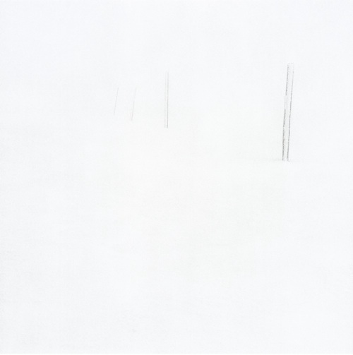
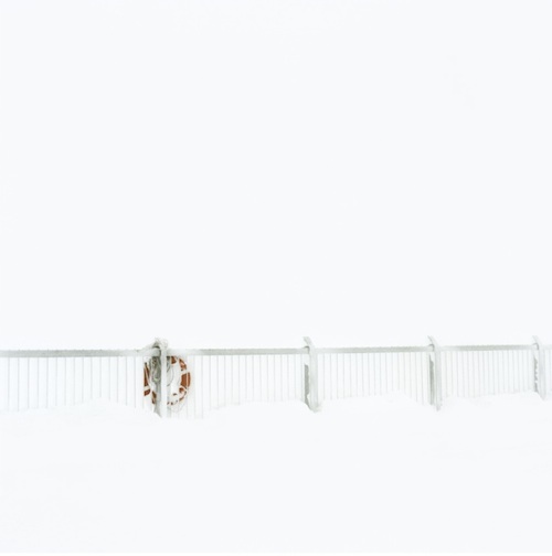
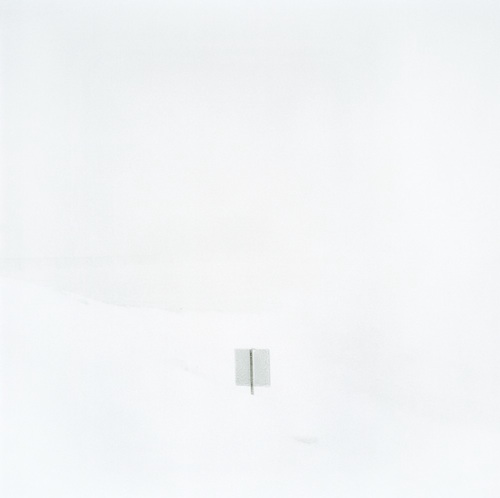
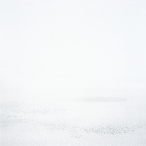
"[ ]" by Ward Roberts
[ ]
With [ ], it was all about framing white, hence the name [ ] or “brackets.” To me, this series was pushing Minimalism to the ridiculous extent, almost where it was just framing white. Taking from Hiroshi Sugimoto, or the Mark Rothko style of just the sublime… Lucio Fontana, just complete, pure, Minimalism. It’s an environment that can be tricky to come by today.
The environment gives it this extra layer of something that is required in Minimalism. Really subtle layers, a bit of texture, a subtle graduation.
On Film
Medium format was strangely uncomfortable at first, because it felt like it came too naturally, it’s just like ok sneak in there, get the shot, it just felt so comfortable. Whereas with large format now it’s brought me back to a level where I have to really focus and concentrate to pair back again and consider what’s going to stay in the frame and what isn’t. Which is what I love.
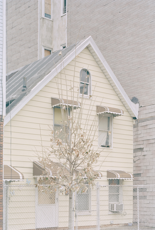
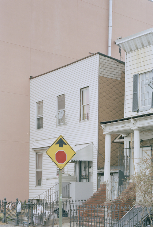
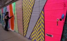
"The Bushwick Series" by Ward Roberts
THE BUSHWICK SERIES (in progress)
Through this series I learned a lot by talking to longtime residents of Bushwick and getting to know how they feel. A lot of them have been here for over twenty years and Bushwick is one of the fastest gentrifying parts of New York in the last year or two. It’s so rapid and unbelievable... talking to some of these people who have been here such a long time about having to move out further. For us living here, it’s like with technology changing and digital, you just have to go with it. Because if you fight it you’re gonna lose.
It's a gritty neighborhood that’s not innocent, it’s not pretty or delicate. I was drawn to the contradiction of it. I set out to explore my connection with the neighborhood I live in.
I started off trying to make it my style. But it didn’t work. I’d have millimeters on either side of the photo where, like, a car would come in or a phone line or a sign I didn’t like or a colored fence that just didn’t really work. It was excruciating because I felt like it was almost there but that one element destroys it.
It’s this kind of environment that I’ve had to… not work around… but actually work with, which has been a huge challenge. But again, it’s about the type of day you choose to shoot, what buildings, what angles, film stock, exposure. It’s all those sorts of elements that help create that kind of color.
Eventually I decided to work with it - embrace the imperfections, let it be what it is and stop trying to make it for myself and shoot it for it.
You look at some of this architecture, seeing a gargoyle on this building, or that they carved out the stairwell, or the stained glass. Then you see these new buildings and it’s like BAM. It begs the question like twenty years ago, were people going “oh man that gargoyle is so ugly and that carving detail is just so awful"? Now it’s like you have a street with pastel colors and some consistency and then all of a sudden pops up neon blue and gray and white, like a “Let’s do this! Get it up within a month and get people in here” type of thing.
On Instagram
My Instagram… well, I was almost fighting a personal war and really not wanting to give in and do it but then it just got to the point where why not, just do it, it’s another way to have people experience your work, to make people think. It’s just another platform, and something I’m really interested in moving towards is experimenting with shooting images for platforms. I want to shoot a series for mobile phone, that is supposed to be viewed in that format. Which is fascinating to me. Shooting for this modern, one second reaction.
You know, and maybe poke a little fun at it as well. It is what it is, and as much as you want to bury your head in the sand… the ages of Massimo Vitali, Hiroshi Sugimoto, Ansel Adams, this day in age they are now so heavily idolized as purists and just so dedicated to their art form. To be honest I’d love to be seen in that light, but it just seems so challenging and that those days are past. To only view something when it’s framed, in the right light, the right structural environment… it’s just no longer what it is. That is upsetting, but again there’s something interesting in being able to explore new territories.
There’s something about a gallery that will always remain sacred, they’re so beautiful and white and minimal, the perfect amount of natural light with florescent light. It just makes me so happy. This is where I would adore to show my work.


