The Colors and Textures of Jamie Tao
Foz do Iguaçu (Iguaçu Waterfalls) is one of Brazil’s most-frequented tourist destinations, one of the most beautiful places I’ve ever traveled to and also the town where my favorite illustrator, Jamie Tao, happens to be from.
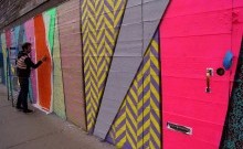
I first met Jamie in Miami as a quiet and quirky art director starting out her career in advertising. From the beginning, she’s had an eye for detail and concept that you can find in her work hiding behind a curve on a type or in the choice of colors and materials she uses to convey her feelings at that specific moment in her life. I’ve seen her work transform from curvy minimalistic doodles, into the explosion of textures that defy the spectrum of colors. Jamie’s work is always evolving. She loves change, she loves to experiment and that’s what makes her craft so unique.
I wish I had the chance to sit with her at a coffee shop to chat about her work, but due to her recent move to LA, we had to settle for a series of emails.
South Rocket Droogs: What was it like growing up in Foz do Iguaçu in Brasil?
Jamie Tao: It was the perfect environment for a tomboy. I mean, I loved my Barbies but I was a street kid. What I remember most fondly is the trouble I would get into with the other neighborhood kids. As early as 5 or 6 years old, I was running around, climbing walls, making up crazy games. One time a man pulled a rifle on us for ringing his doorbell over and over. We deserved it.
SRD: Who influences your work?
JT: I was introduced to Eduardo Recife’s work many years ago and he is still one of my favorites. Everything from his colors to his vintage imagery and typography…seriously, so good. David Fullarton is also incredible. His work is absolutely beautiful but juxtaposed with sharp, snarky lines. He makes you think about how funny humans are.
SRD: Throughout the years, we've seen your work transform in terms of color palette and visual treatments, what caused this transformation?
JT: My work is influenced by what’s going on in my life at the moment. With time, your interests change, your zip code changes, your way of thinking and seeing things change. So my work is a direct reflection of that.

SRD: How do you balance your personal art vs your daily job as an art director in advertising?
JT: Being in advertising is more than a full-time job. So it’s a good thing that I truly love making and creating just about anything. It’s what I do on my down time.
SRD: What would be your dream design assignment?
JT: Anything that involves some hand lettering, lots of color, and at a large scale. I want to be able to see it from far away.
SRD: How are you liking the West Coast and how’s it influencing your new work?
JT: It’s been my dream since I can remember to live in California. It just feels good here. The sunshine, the beach, the radioactive seafood – that’s what life’s about now. And I think it translates onto my work. My previous work had a little more angst in it, at least with my choice of words. Now it’s less angst, more cynicism.

SRD: Tell us about your “A Little Beast” Project.
JT: “A Little Beast” is an idea that sparked between my boyfriend and I, who’s a copywriter, a couple of years ago. It’s a project that’s still cooking but we have big plans for that little guy. Basically, it’s going to be a creative site with work from all kinds of creative minds that the Little Beast has visited. We’ve all found our inspiration. We just gave that inspiration a name.


